66 Poorly Designed Signs That Resulted In Hilarious Messages (New Pics)
 x Facebook Pinterest Twitter
  Fails, FunnyPublished Jun 19, 2026
 66 Poorly Designed Signs That Resulted In Hilarious Messages (New Pics)


 Adelaide May Ross,
 Evelina Šiukšterytė and
Mantas Kačerauskas
2
34
2
Link copied!
Share
Link copied!
Share
PublishNot your original work? Add source
If someone is tasked with creating a sign, the most important thing to keep in mind is ensuring that their message is clear. Whether they’re advertising for a company, fundraising for a charity, or trying to find their lost cat, if people can’t read their sign, it’s pointless.
But sometimes, even if viewers can read it, they still take it to mean something completely different than what the author intended. We took a trip to a subreddit that’s dedicated to sharing comically bad signs. All of these photos feature signs that make absolutely no sense when read from left to right, so their messages were completely lost. Enjoy scrolling through these hilarious pics, and be sure to upvote the designs that you can’t believe people thought would be a good idea!
This post may include affiliate links.
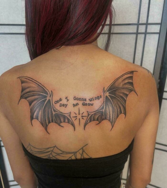
#1One I Gonna Wings Day Am Grow
 POST
POST  Bonesko Bonesko Community Member • points posts comments upvotes FollowUnfollow 5 days ago
 One I gonna regret day got this tattoo
31 31points reply View more comments RELATED:We Don't Care. Stop
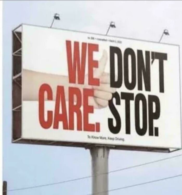 POST Bonesko Bonesko Community Member • points posts comments upvotes FollowUnfollow 5 days ago
 I'll stop, but you don't need to be rude
10 10points reply View more comments #3Fourskin Co. Season
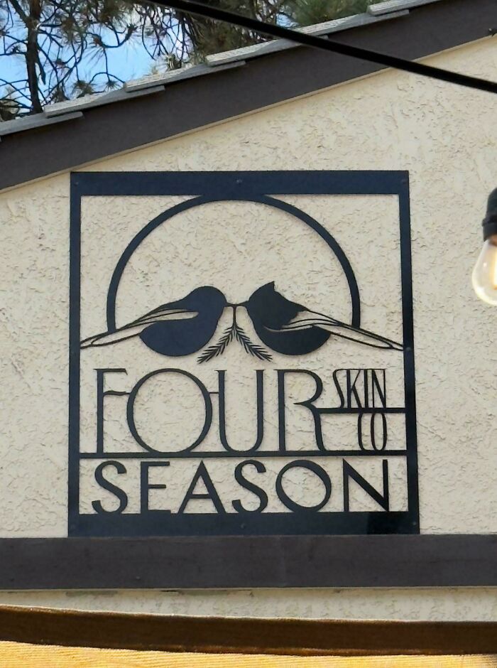 POST
POST  Jan Rosier Jan Rosier Community Member • points posts comments upvotes FollowUnfollow 5 days ago
 Before reading the text, I asked myself 'why did they make it look like a skull' ?
21 21points reply View more commentsYou might assume that you’re an expert on signage based purely on the fact that you’ve seen thousands of them. Nowadays, it’s kind of impossible to avoid them. We’re bombarded with signs when driving on the highway, walking down the street, passing any business, and even when we open up any webpage. In fact, the average person consciously sees about 100 ads per day, many of which come in the form of signs.
But just because we’re all used to seeing signs doesn’t mean that we have the skills to create them. As we can clearly see from this list, it’s harder than it looks! Apparently, it’s extremely important to get a second, third, or perhaps even a tenth opinion before sending a sign to print. Or you might get roasted online for creating a ridiculous message like “We Don’t Care, Give Up.”
#4Twisted Bar And Monkey Grill
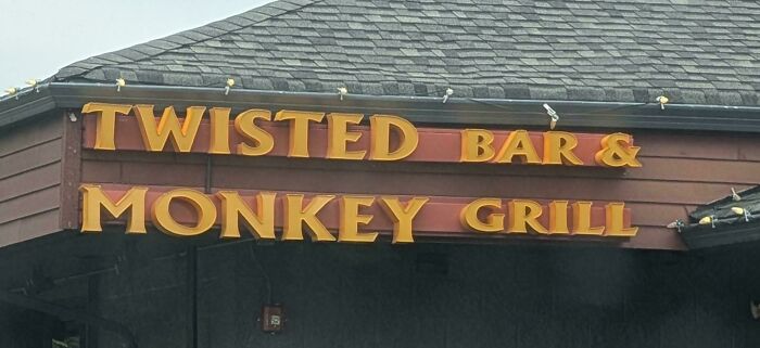 POST
POST  Floeckchen Floeckchen Community Member • points posts comments upvotes FollowUnfollow 5 days ago
 Indiana Jones 2 flashbacks
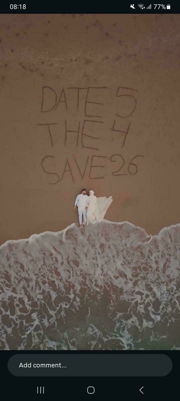
17 17points reply View more comments #5Date 5 The 4 Save 26 (Supposed To Say Save The Date 5/4/26)
 POST
POST  sbj sbj Community Member • points posts comments upvotes FollowUnfollow Premium
  Premium user. Get details. 5 days ago
 Still a nice wedding photo and they'll have an excuse to keep bringing the photo out to show people without boring them because it's funny
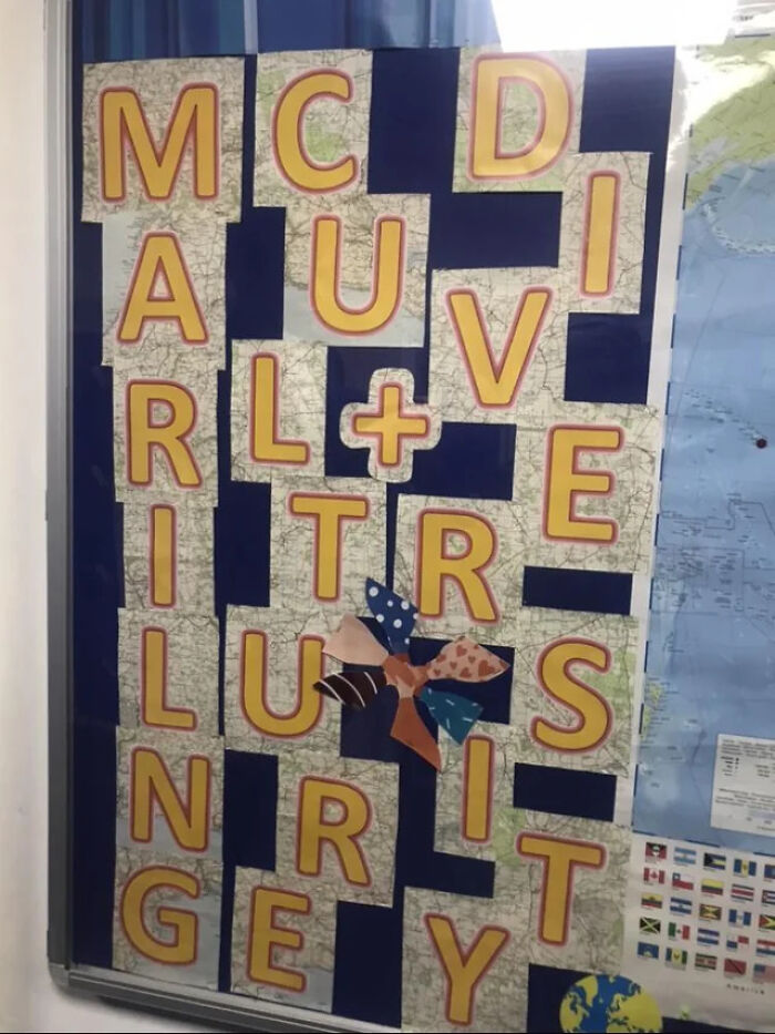
7 7points reply View more comments #6Mc D A U I Rl+vi Tr E Lu S N R It Ge Y
 POST
POST  Roman Arendt Roman Arendt Community Member • points posts comments upvotes FollowUnfollow 5 days ago
 I didn't want to take Advil with my breakfast, but I guess I have to now.
11 11points reply View more commentsIf you want to avoid the mistakes that have been made on this list, Vistaprint published “The Ultimate Guide To Signage Design,” so we’ll share some of their wisdom with you, pandas. First, they note that there are different types of signs that serve various purposes, so it’s important to understand the specific niche you want to fit into first.
Designing a billboard is different from designing a banner, and A-frames, digital screens, shop fronts, and flags all have their unique requirements as well. So step one requires doing lots of research. Peruse loads of inspiration first, and understand exactly what you want (and don’t want) before committing to anything concrete.
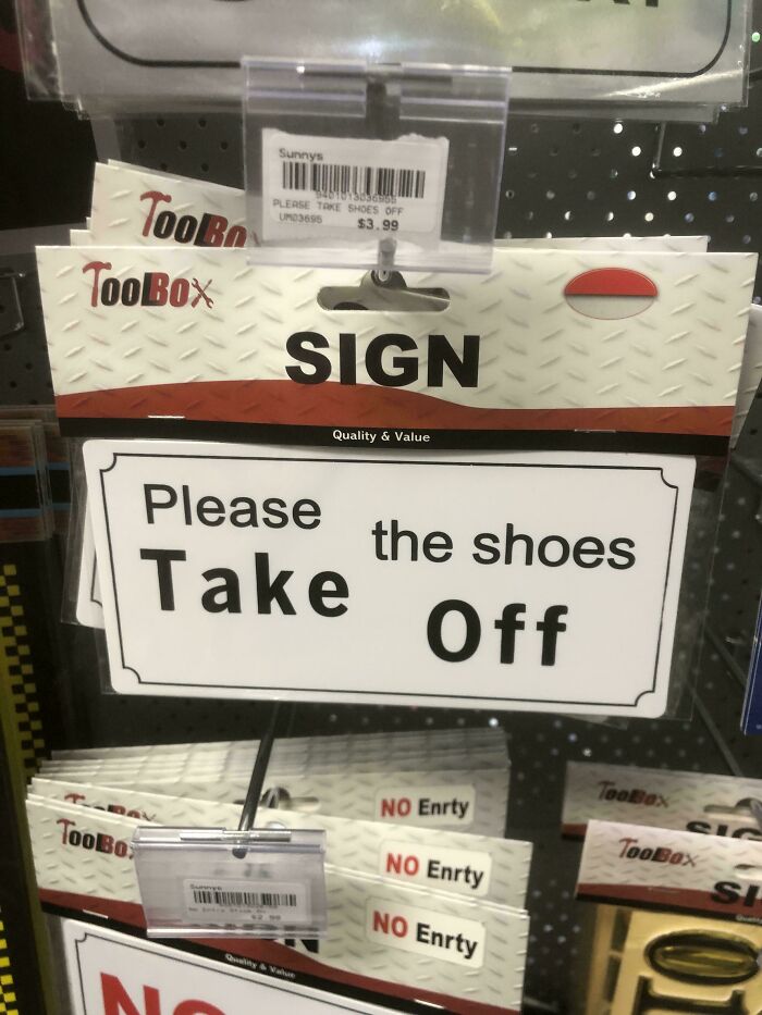
#7Please The Shoes Take Off
 POST SCP 4666 SCP 4666 Community Member • points posts comments upvotes FollowUnfollow 5 days ago
 Yoda before inviting Luke to his hut
13 13points reply View more comments #8Hi Do Not Mix Please The Beans
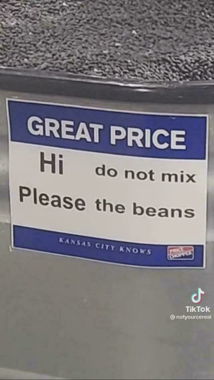 POST
POST  Spidercat Spidercat Community Member • points posts comments upvotes FollowUnfollow 5 days ago
 Please your own bean you filthy bügger...
14 14points reply View more comments #9Do You Fitter? Want Stronger?
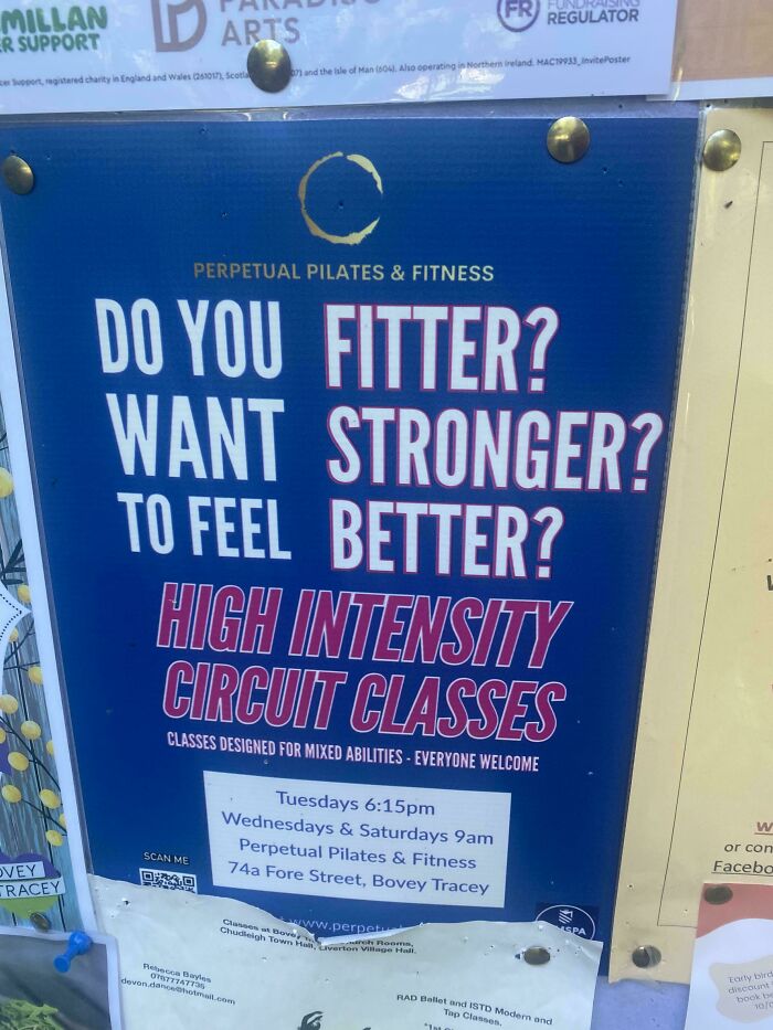 POST Bonesko Bonesko Community Member • points posts comments upvotes FollowUnfollow 5 days ago
 Yes, yes, and yes
3 3points reply View more commentsOnce you’ve made it to the drafting stage of designing a sign, it’s important not to get too attached to any one idea. Feel free to play around and experiment to ensure you find the best possible design. And once you do believe that you’re making progress, you’ll have to get reviews and feedback from people whose opinions you trust. It’s not always easy to hear critiques, but it’s much better to hear them in the drafting stage than after you’ve printed 300 signs.
#10Feed Me And Tell Me Tacos I'm Pretty
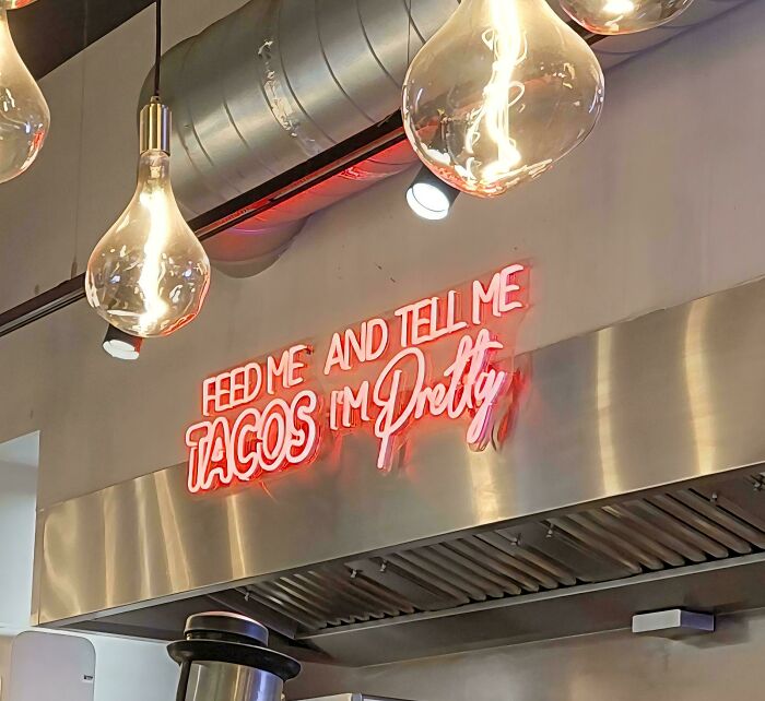 POST
POST  Glix Drap Glix Drap Community Member • points posts comments upvotes FollowUnfollow Premium Premium user. Get details. 5 days ago
 Tacos, your pretty.
7 7points reply View more comments #11If Your Drink Reading This Water
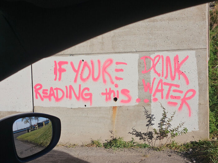 POST
POST  WindySwede WindySwede Community Member • points posts comments upvotes 5 days ago
 Your≢you're 🙃
6 6points reply View more comments #12Wash Plyur Eaown Secup
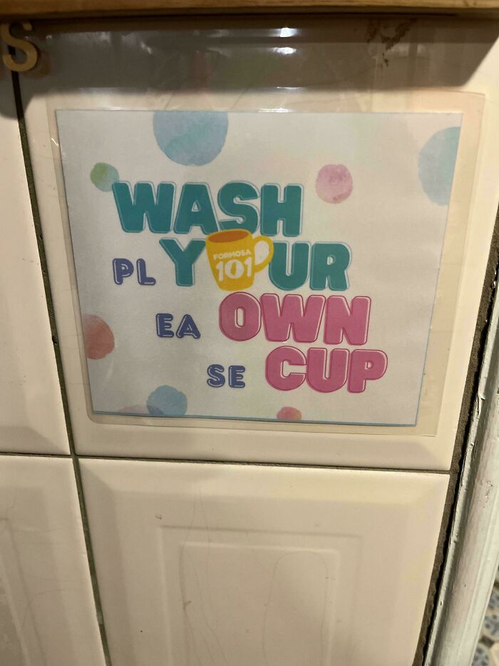 POST Glix Drap Glix Drap Community Member • points posts comments upvotes FollowUnfollow Premium Premium user. Get details. 5 days ago
 If they'd put 'please' across the bottom rather than down the side it would have been fine.
5 5points reply View more commentsWhen it comes to the most important elements of sign design, Vistaprint says color, typography, graphics and images, material, texture, and size and scale are crucial to consider. You want the sign to stand out, but in a good way. You need the font to be legible and appropriate for the message, but the correct size as well. The text should be concise, perfectly visible, and engaging. Ideally, the message will be one that people remember and something that’s consistent with the rest of the brand.
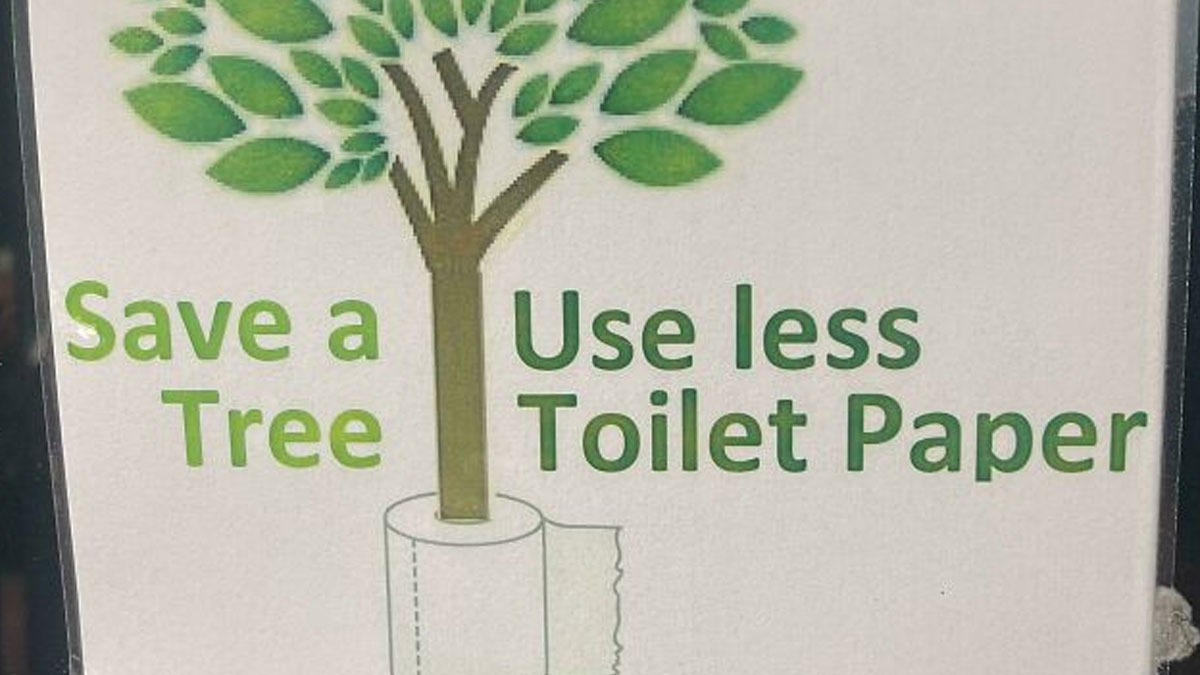
#13Save A Useless Tree Toilet Paper
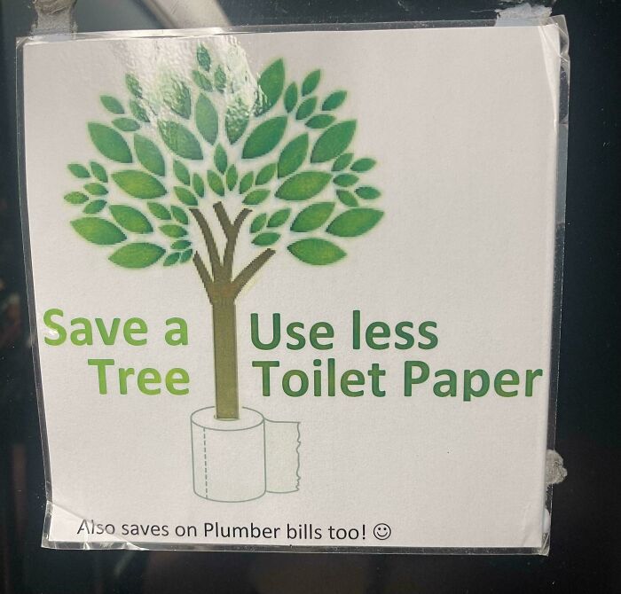 POST sbj sbj Community Member • points posts comments upvotes FollowUnfollow Premium Premium user. Get details. 5 days ago
 I read this correctly due to the different shades of green
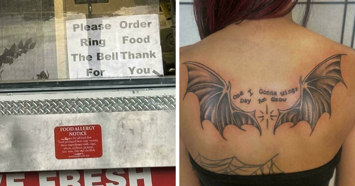
22 22points reply View more comments #14Please Order Ring Food The Bell Thank For You
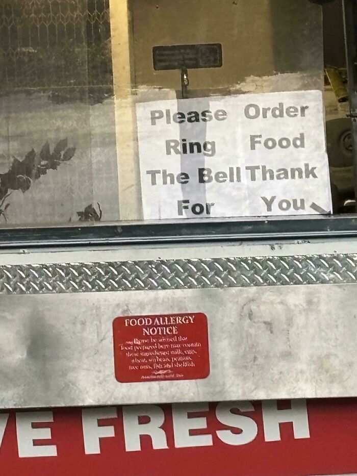 POST
POST  meow point1 meow point1 Community Member • points posts comments upvotes FollowUnfollow 4 days ago
 You're for welcome!
3 3points reply #15(Berlin) More Who Than Are A You Gym
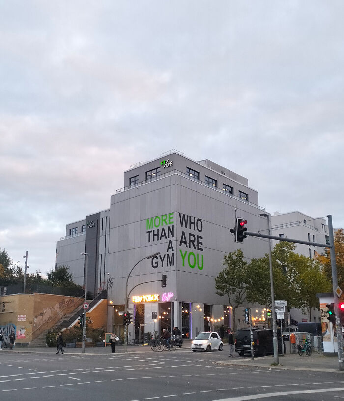 POST Roman Arendt Roman Arendt Community Member • points posts comments upvotes FollowUnfollow 5 days ago (edited)
 Doesn't even make sense when you read it the way those responsible intended.
7 7points reply View more commentsAs for some of the most common mistakes sign designers tend to make, Forbes warns that a lack of contrast can ruin any great message. If the text doesn’t stand out from the background, nobody will be able to read it. But that doesn’t mean the colors should clash. There’s a fine line between having a bold contrast and hurting people’s eyes when they look at the sign.
#16Lucky Fried Geandma Skewers
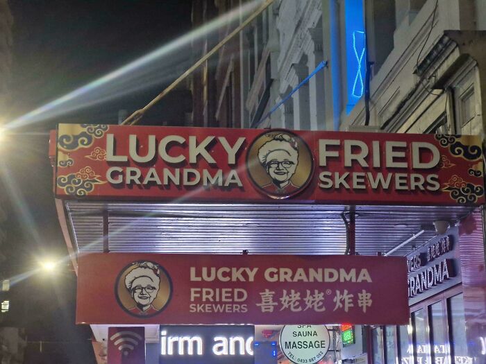 POST Floeckchen Floeckchen Community Member • points posts comments upvotes FollowUnfollow 5 days ago
 The meat was a bit tough
4 4points reply View more comments #17Ghafy Oapoo Dslru A N
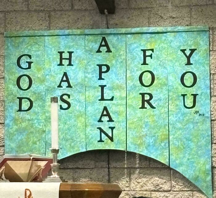 POST sbj sbj Community Member • points posts comments upvotes FollowUnfollow Premium Premium user. Get details. 5 days ago
 I hope not, I'm quite happy going through life like a headless chicken
6 6points reply View more comments #18Twenty The One Cure Pilots And Many More
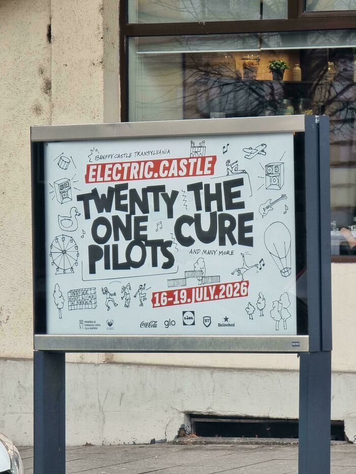 POST Glix Drap Glix Drap Community Member • points posts comments upvotes FollowUnfollow Premium Premium user. Get details. 5 days ago
 So many questions. Cure the pilots of what? Why are there only 21 of them? Why only 4 days to do it in? Does the castle have gas as well as electricity?
4 4points reply View more commentsSomething else to consider is the artwork featured on a sign. The words might be the most important part, but the images featured play a huge role too. It’s extremely important to put artwork in front of many eyes to ensure that it won’t be misconstrued. This means having viewers look at it from various distances to see if it translates from close up and far away. And if your company has a logo, it’s wise to include that in any and all signage too.
#19Pflugerqb Villegyn
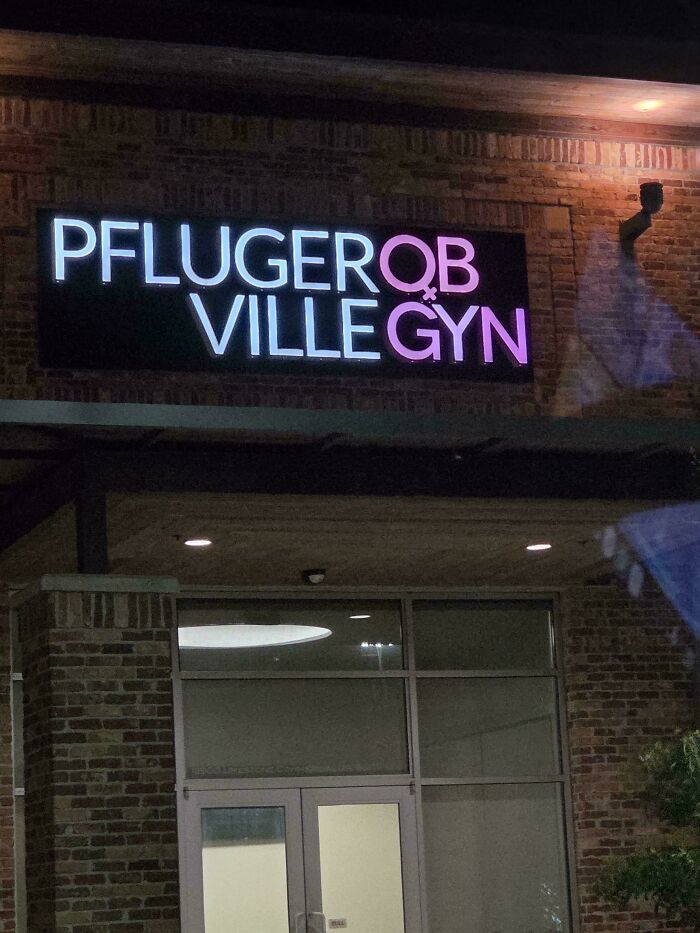 POST
POST  Thomas Savi Thomas Savi Community Member • points posts comments upvotes FollowUnfollow 3 days ago
 Not German
1 1point reply View more comments #20Make War, Art Not
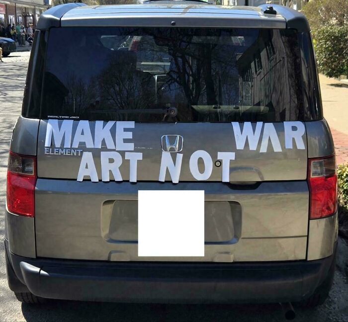 POST
POST  Meyrin Meyrin Community Member • points posts comments upvotes FollowUnfollow 4 days ago
 Adi?
2 2points reply #21Fere
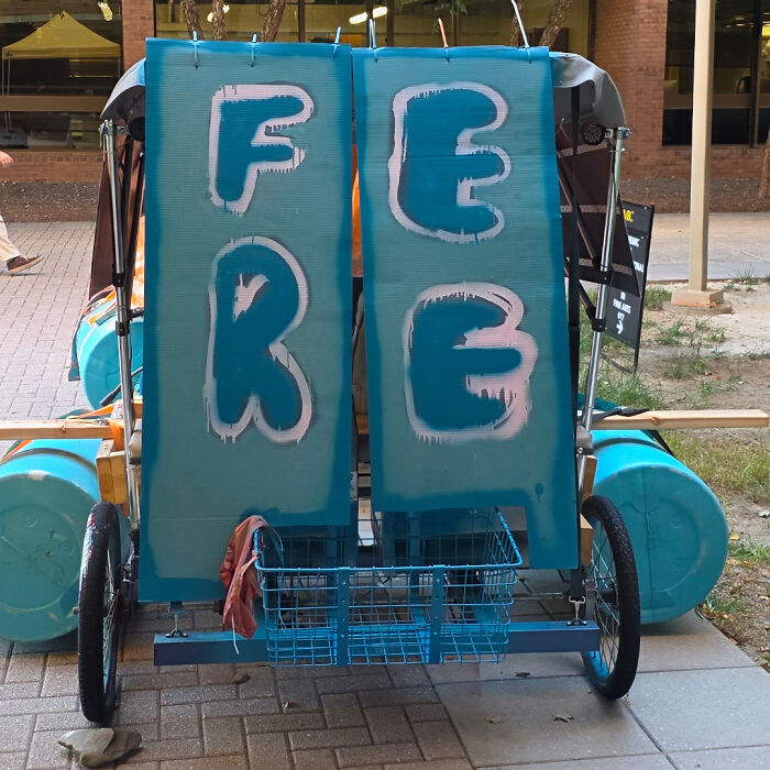 POST Meyrin Meyrin Community Member • points posts comments upvotes FollowUnfollow 4 days ago
 And to this day no one has taken it because ...well fere
1 1point reply View more commentsFinally, sign designers (de-sign-ers?) have to remember that their work doesn’t exist in a vacuum. They must consider the context in which people will view their messages. If the design doesn’t match the location where it will be seen, it’s never going to be effective. For example, what works well on a billboard in the center of a city might be pointless on a beachside boardwalk. Remember all of these factors if you want to get your point across.
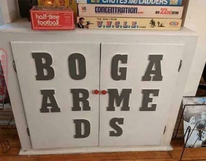
#22Boga Arme Ds
 POST
POST  JF JF Community Member • points posts comments upvotes FollowUnfollow 1 hour ago
 Ok, but where do I get that Man From U.N.C.L.E board game?
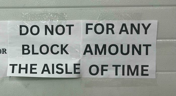
0 0points reply View more comments #23Do Not For Any Block Amount The Aisle Of Time
 POST Glix Drap Glix Drap Community Member • points posts comments upvotes FollowUnfollow Premium Premium user. Get details. 5 days ago
 The aisle of time must never be blocked.
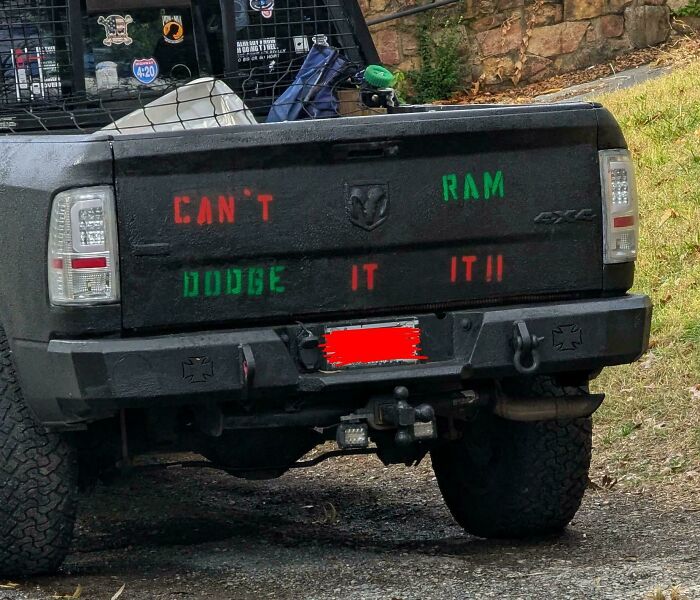
8 8points reply View more comments #24Can't Ram Dodge It It!!
 POST
POST  Serial pacifist Serial pacifist Community Member • points posts comments upvotes FollowUnfollow 4 days ago
 Very hillbillicious.
3 3points replyAre you enjoying these hilarious sign fails, pandas? Keep upvoting the ones that you can’t believe were actually printed, and let us know in the comments below what the worst sign you’ve ever spotted out in the wild was. Then, if you’re interested in checking out another list from Bored Panda featuring the same subreddit, look no further than right here!
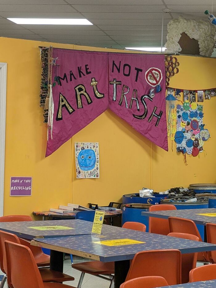
#25Make Not Art Trash
 POST Glix Drap Glix Drap Community Member • points posts comments upvotes FollowUnfollow Premium Premium user. Get details. 5 days ago
 That does look a bit like art trash to me - so is this meant to be ironic?
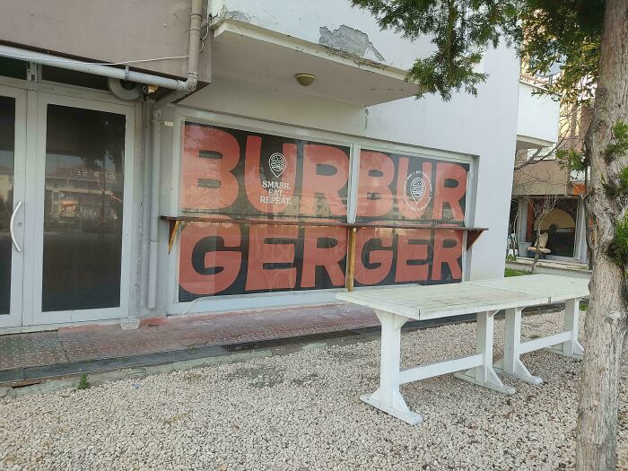
4 4points reply View more comments #26Burbur Gerger?
 POST
POST  Ola Pe Ola Pe Community Member • points posts comments upvotes FollowUnfollow 4 days ago
 I actually like BurBur GerGer… is it just MeMe?
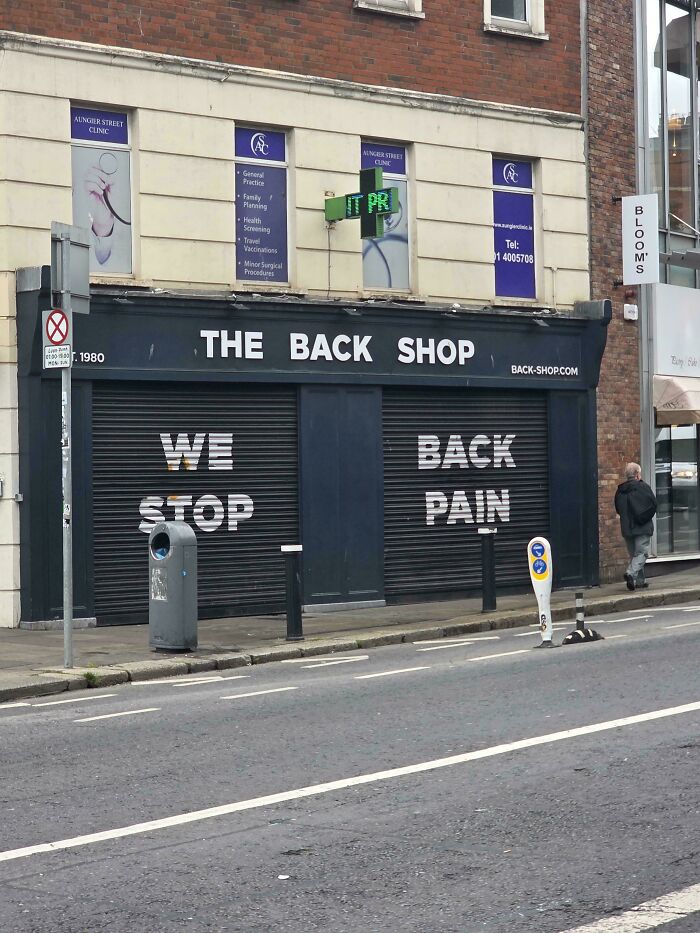
3 3points reply View more comments #27We Back. Stop Pain
 POST Bonesko Bonesko Community Member • points posts comments upvotes FollowUnfollow 5 days ago
 Finally! They're back!
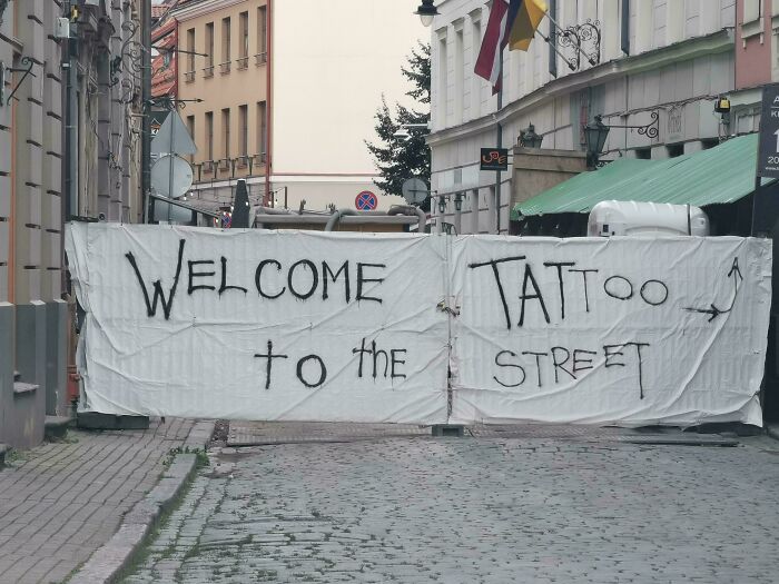
5 5points reply View more comments #28Welcome Tattoo To The Street
 POST WindySwede WindySwede Community Member • points posts comments upvotes 5 days ago
 Well, graffiti are the tattoo of the streets?
3 3points reply View more comments #29We Bad, Fix Jobs
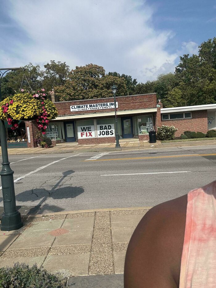 POST Glix Drap Glix Drap Community Member • points posts comments upvotes FollowUnfollow Premium Premium user. Get details. 5 days ago
 Mr Jobs is d**d, so I really think fixing him is a bad idea Dr Frankenstein.
1 1point reply View more comments #30Black Black Power Pride
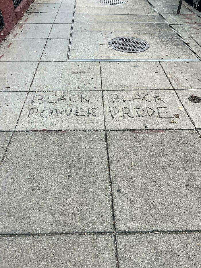 POST Serial pacifist Serial pacifist Community Member • points posts comments upvotes FollowUnfollow 4 days ago
 I think this one is just across White White Weakness Shame
1 1point reply #31Will Be You My Player For Two Life?
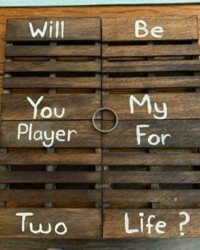 POST Glix Drap Glix Drap Community Member • points posts comments upvotes FollowUnfollow Premium Premium user. Get details. 5 days ago
 Can't I be player one sometimes?
We Am Arebitious
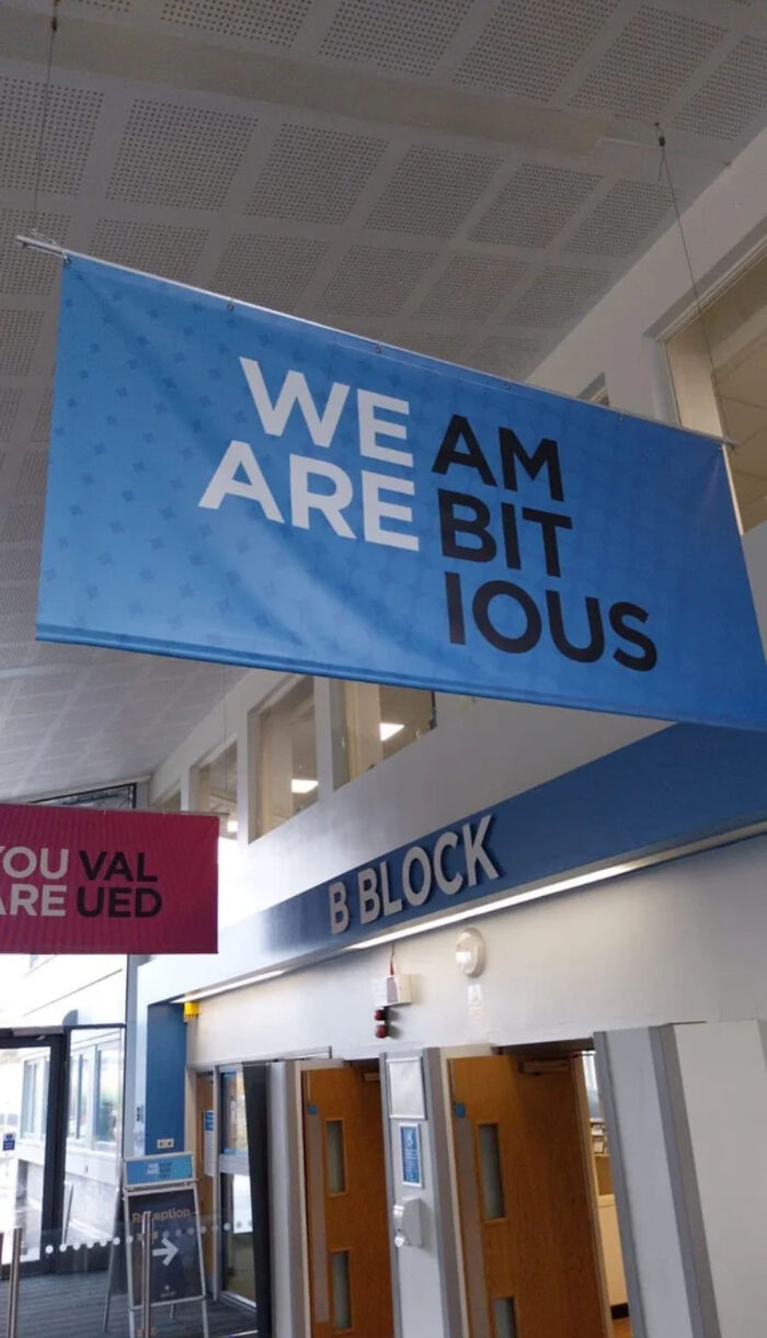 POST Glix Drap Glix Drap Community Member • points posts comments upvotes FollowUnfollow Premium Premium user. Get details. 5 days ago
 I'm a bit ious as well, but that could be something I ate.
5 5points reply View more comments #33Be Pet Gay Dogs
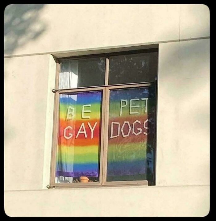 POST
POST  zatrisha zatrisha Community Member • points posts comments upvotes FollowUnfollow Premium Premium user. Get details. 4 days ago
 Like you should!
0 0points reply View more comments #34Now This Watch Drive
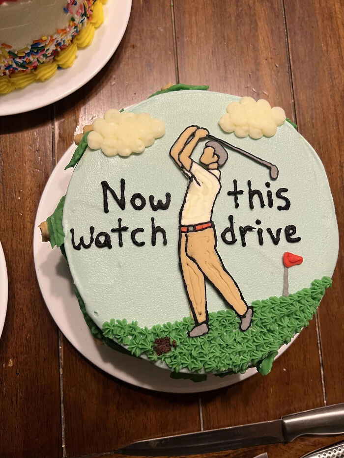 POST
POST  Sue Ellen Jensen Sue Ellen Jensen Community Member • points posts comments upvotes FollowUnfollow 3 days ago
 The bulge in the pants is a little odd.
1 1point reply View more comments #35Please Snacks Open Inside
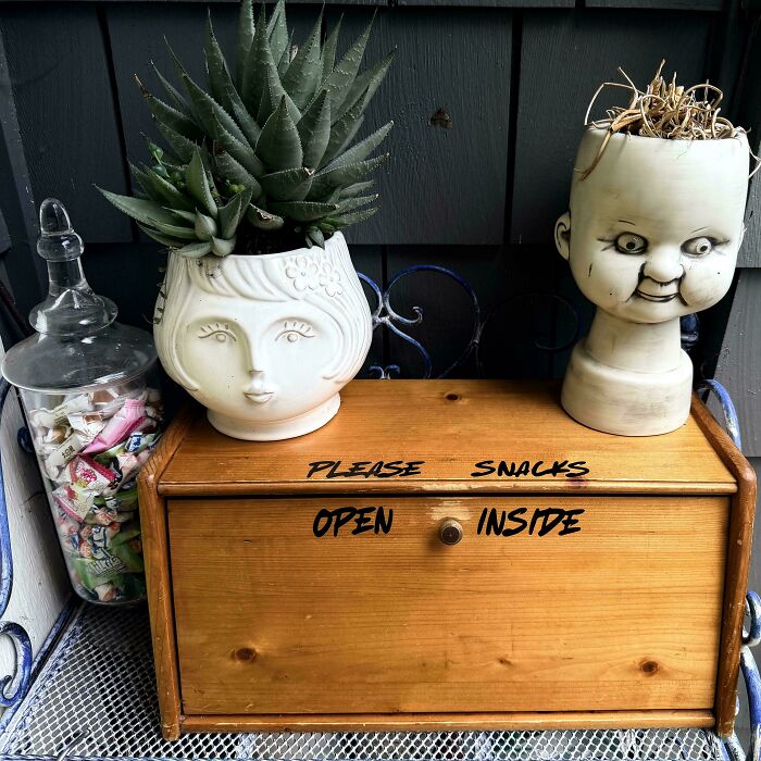 POST WindySwede WindySwede Community Member • points posts comments upvotes 5 days ago
 No worries, I have my own snacks... 😬
5 5points reply View more comments #36Check Leave Out Happy
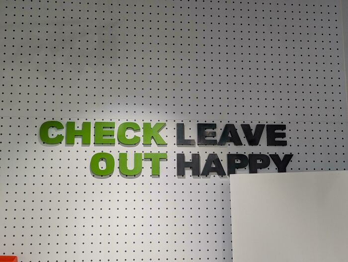 POST Glix Drap Glix Drap Community Member • points posts comments upvotes FollowUnfollow Premium Premium user. Get details. 5 days ago
 He people, I have something to tell you about Happy.
2 2points reply #37If This Is… You’re All You Do… Missing Most Of The Gym
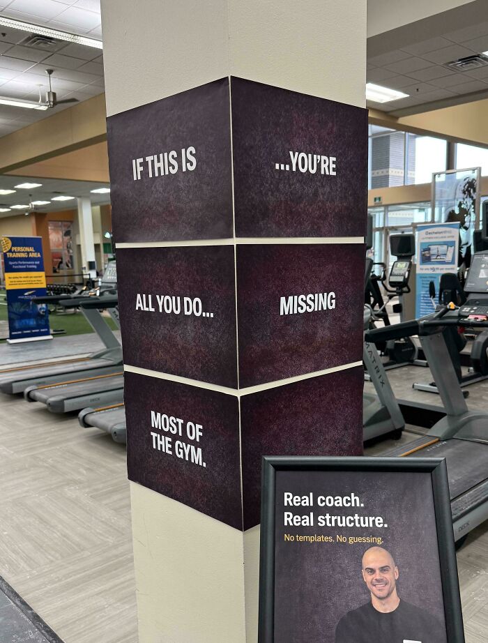 POST Glix Drap Glix Drap Community Member • points posts comments upvotes FollowUnfollow Premium Premium user. Get details. 5 days ago
 No guessing? Think you may have an issue with your ad agency.
1 1point reply View more comments #38Leftovers Smorgs To Take Only Cannot Be Go Can Be What You Taken Purchased Can Eat
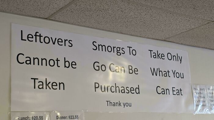 POST Thomas Savi Thomas Savi Community Member • points posts comments upvotes FollowUnfollow 3 days ago
 What’s a smorg
2 2points reply View more comments #39We Indian Brew Only
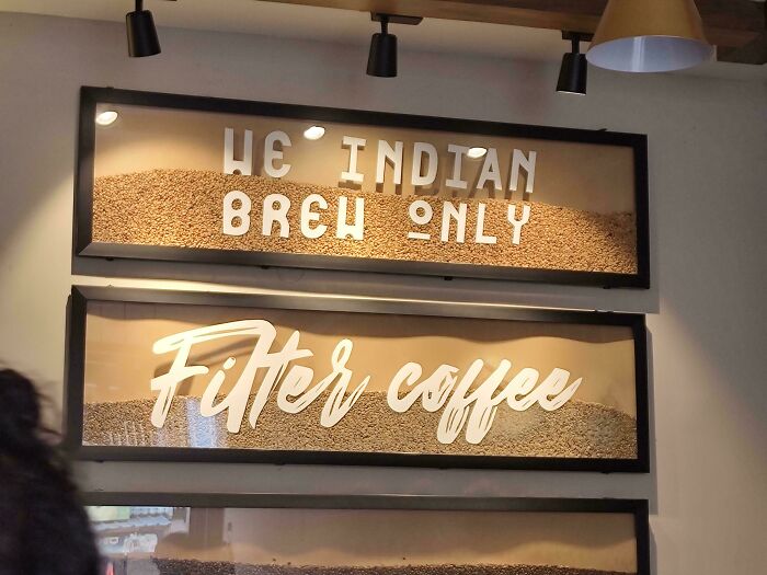 POST Thomas Savi Thomas Savi Community Member • points posts comments upvotes FollowUnfollow 3 days ago
 That font…
1 1point reply View more comments #40Wish Dream Do, It, It, It!
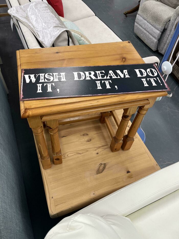 POST Jan Rosier Jan Rosier Community Member • points posts comments upvotes FollowUnfollow 5 days ago
 NI !
7 7points reply View more comments #41Trans Intolerance Rights Must Are Not Human Be Rights Tolerated
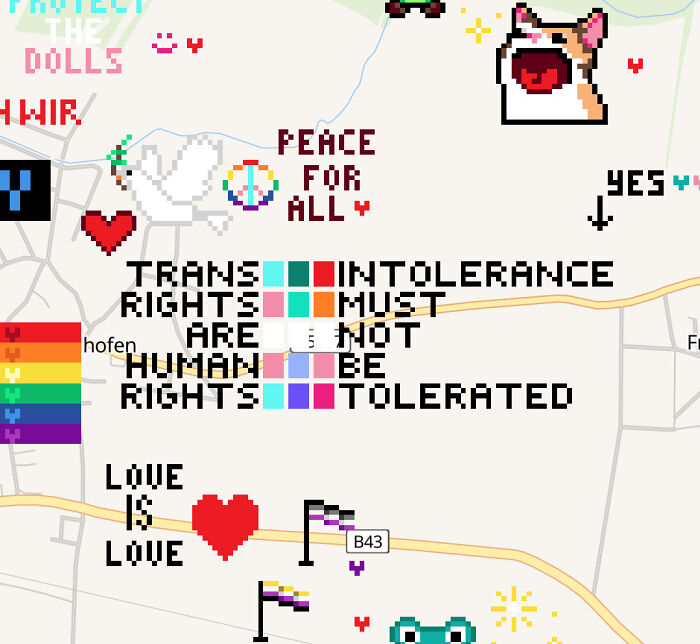 POST Glix Drap Glix Drap Community Member • points posts comments upvotes FollowUnfollow Premium Premium user. Get details. 5 days ago
 Couldn't have said it better myself.
4 4points reply View more comments #42Safe Are Best, Spaces The Places!
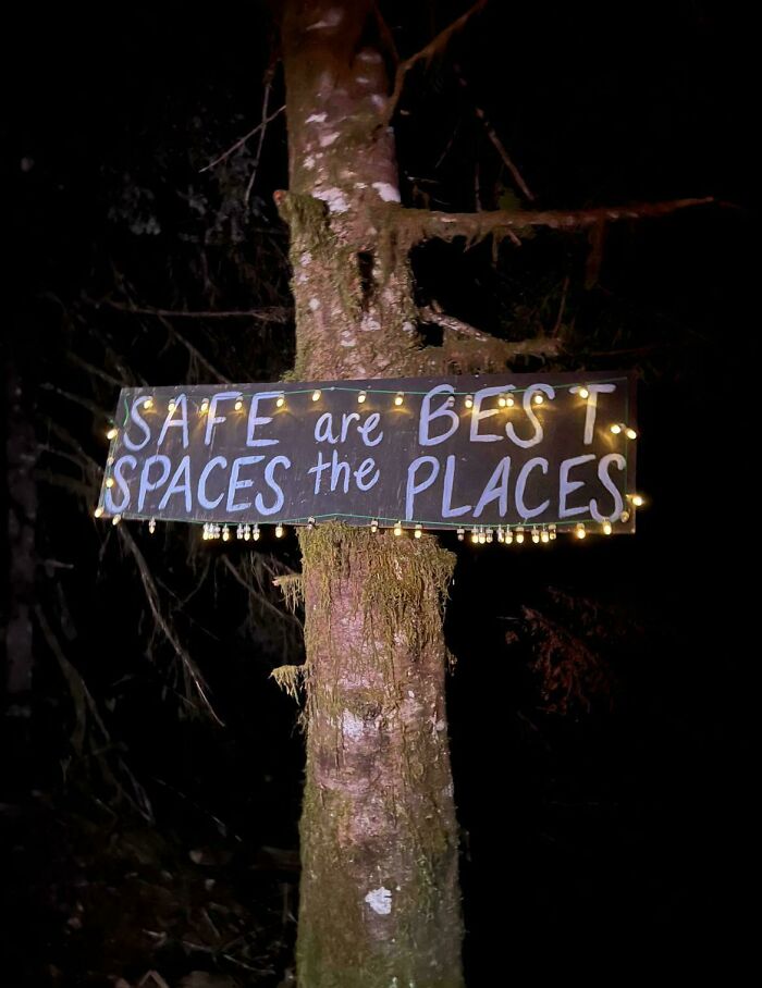 POST Serial pacifist Serial pacifist Community Member • points posts comments upvotes FollowUnfollow 4 days ago
 Spaces the places and bases the aces!
0 0points reply View more comments #43The MA Good RI Satan
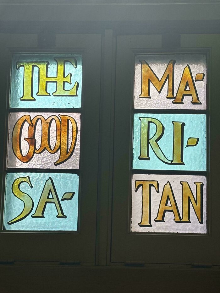 POST Floeckchen Floeckchen Community Member • points posts comments upvotes FollowUnfollow 5 days ago
 The good Mari Satan
3 3points reply View more comments #44Hot Onion Corn, Dogs Ring Dogs
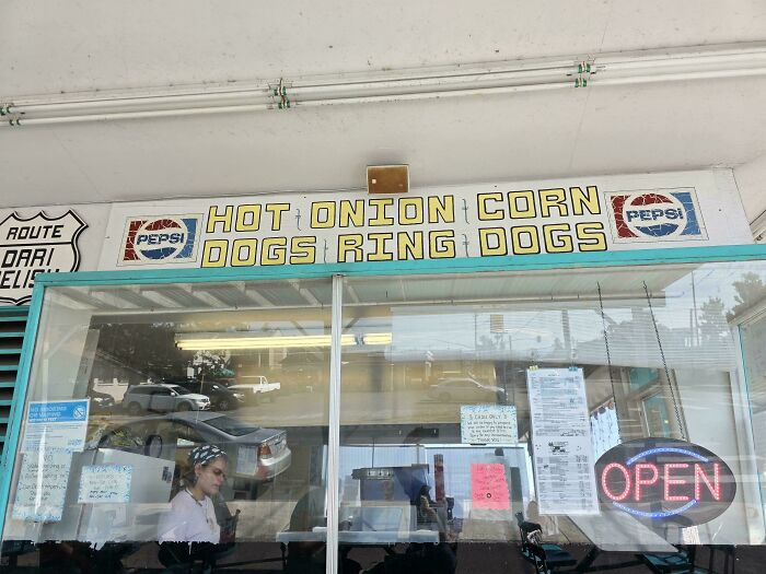 POST Glix Drap Glix Drap Community Member • points posts comments upvotes FollowUnfollow Premium Premium user. Get details. 5 days ago
 Dogs Ring Dogs - social media is really getting out of hand.
2 2points reply #45We Who R We R
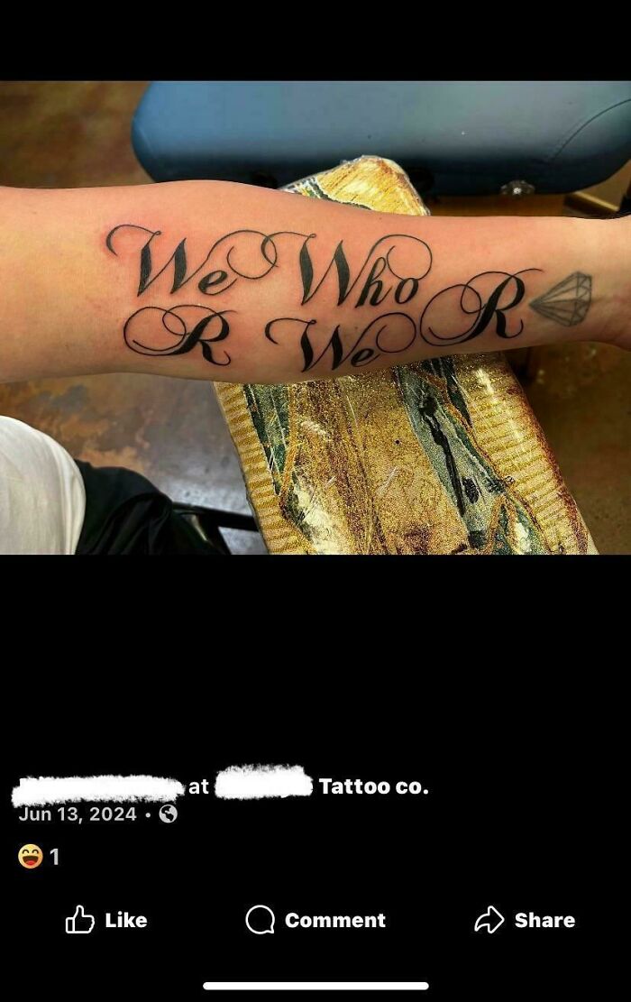 POST
POST  royal crablets royal crablets Community Member • points posts comments upvotes 4 days ago
 Troopers three, virtual reality.
0 0points reply #46For Squeeze Service Me
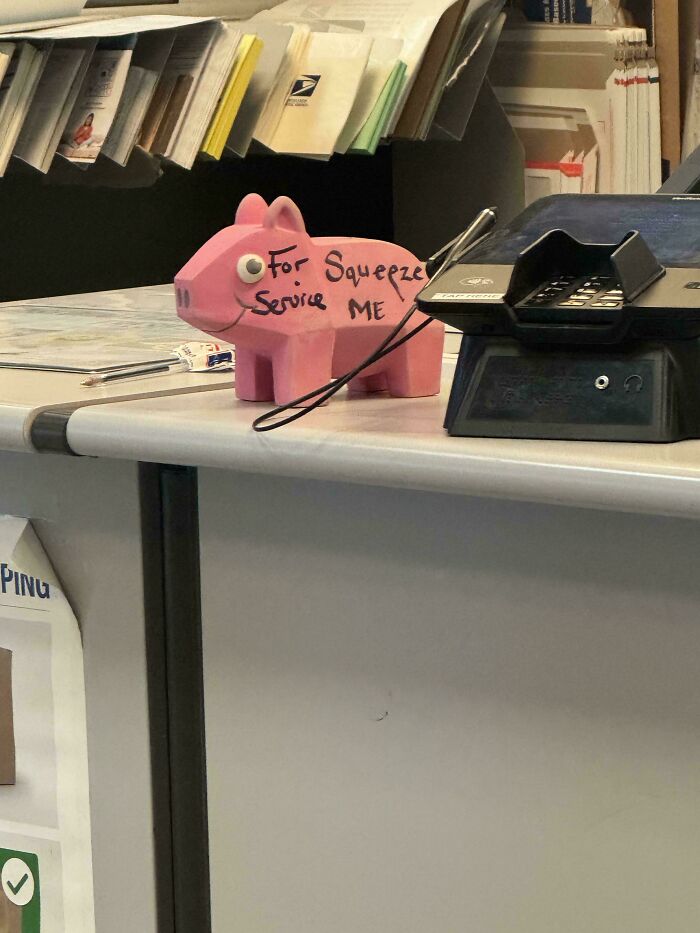 POST Glix Drap Glix Drap Community Member • points posts comments upvotes FollowUnfollow Premium Premium user. Get details. 5 days ago
 Will you squeak when I service you?
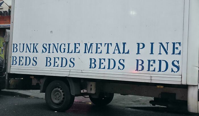
3 3points reply View more comments #47Bunk Single Metal Pine Beds Beds Beds Beds
 POST
POST  JJ Leno JJ Leno Community Member • points posts comments upvotes FollowUnfollow 3 days ago
 Hope they don't buy a longer truck anytime soon.
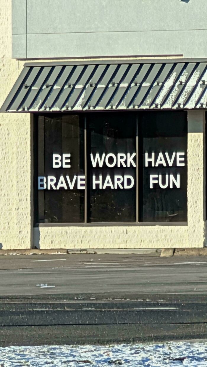
1 1point reply View more comments #48Be Work Have Brave Hard Fun
 POST Glix Drap Glix Drap Community Member • points posts comments upvotes FollowUnfollow Premium Premium user. Get details. 5 days ago
 You got me at hard fun.
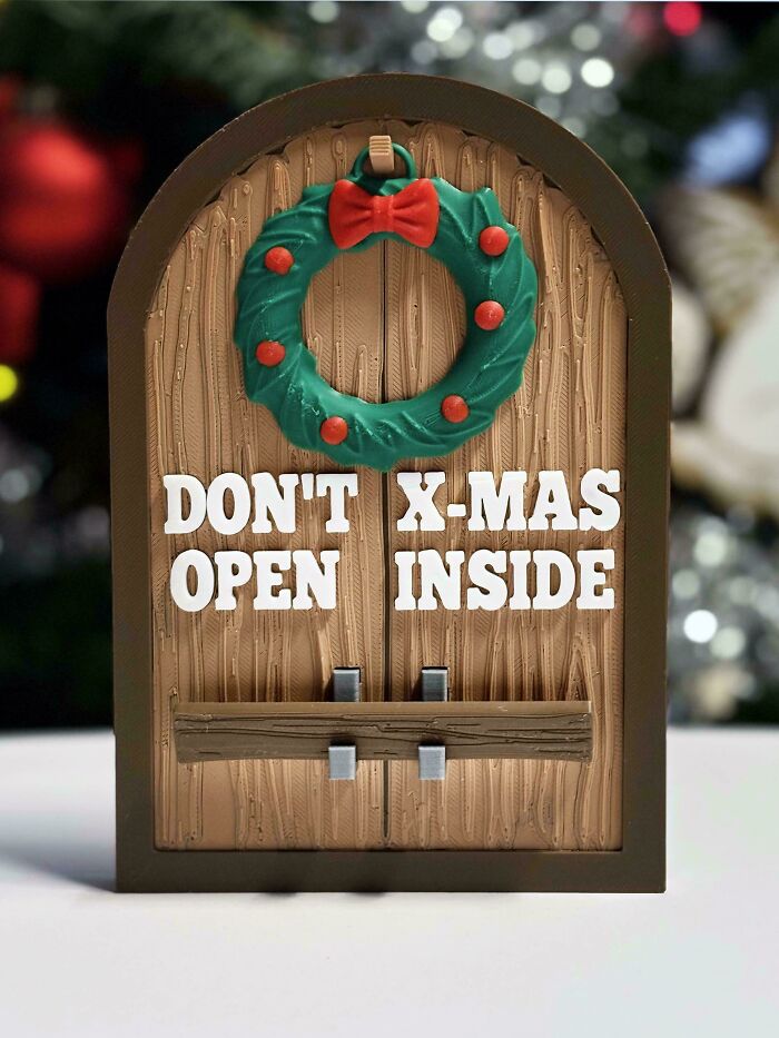
5 5points reply View more comments #49Don't X-Mas Open Inside
 POST #50
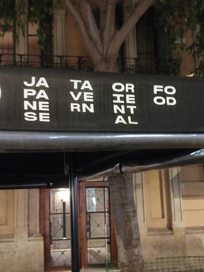
 Jataorfo Paveieod Nernnt Seal
 POST Thomas Savi Thomas Savi Community Member • points posts comments upvotes FollowUnfollow 3 days ago
 That’s a horrible way of putting it on a sign in the first place! It took me 30 seconds to decipher what it was actually supposed to mean
1 1point reply #51No Added Apple Sugar Cake
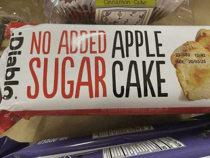 POST Roman Arendt Roman Arendt Community Member • points posts comments upvotes FollowUnfollow 5 days ago
 Seems about right.
2 2points reply View more comments #52Mind When Your Head Leaving
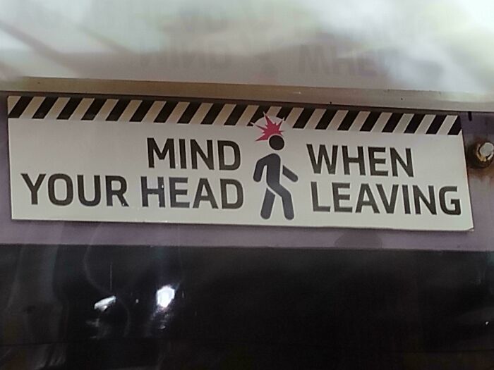 POST Glix Drap Glix Drap Community Member • points posts comments upvotes FollowUnfollow Premium Premium user. Get details. 5 days ago (edited)
 Yoda was here.
2 2points reply View more comments #53Cant Your Hear Horn
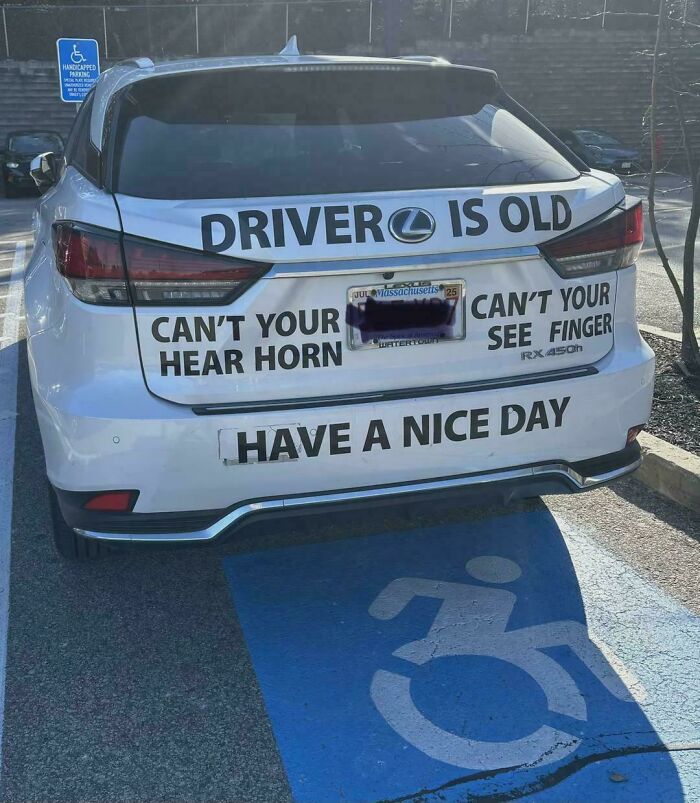 POST WindySwede WindySwede Community Member • points posts comments upvotes 5 days ago
 Driver needs to not drive if not safe on road (but scrambled)
4 4points reply View more comments #54Walk Better Your Brain Way To Health
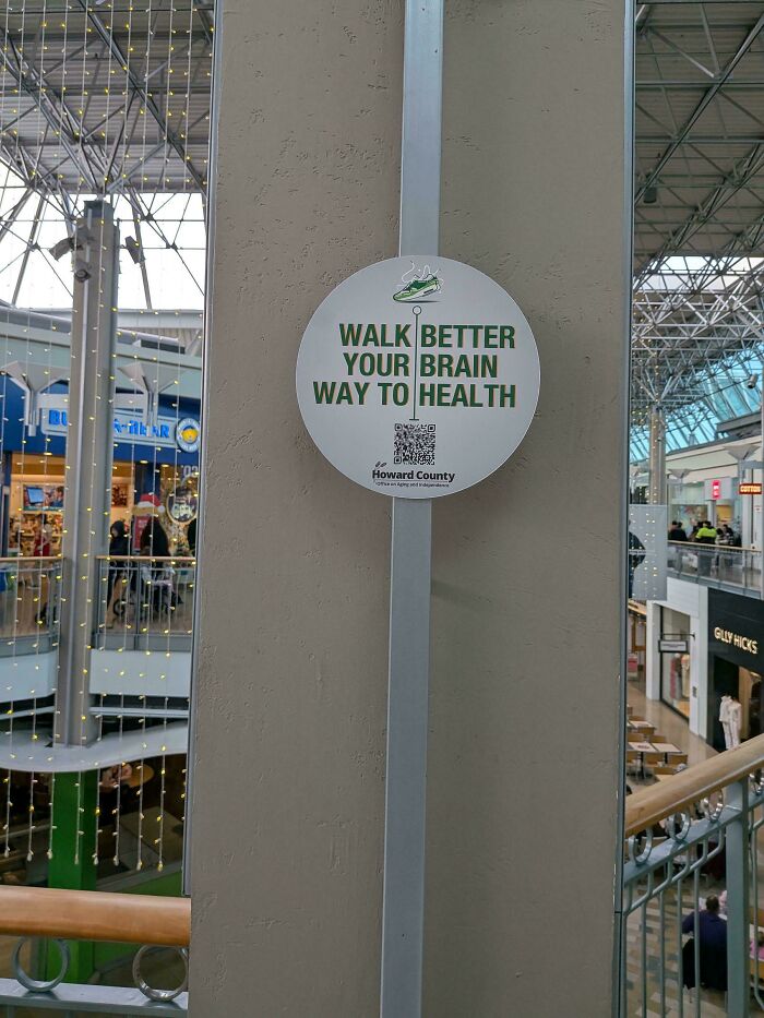 POST zatrisha zatrisha Community Member • points posts comments upvotes FollowUnfollow Premium Premium user. Get details. 4 days ago
 BRAAAAAINWAY TO HEALTH!
1 1point reply #55Please Skate, Do Not Board, Ride In Store
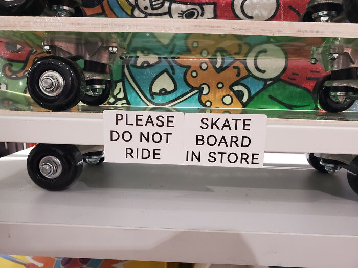 POST WindySwede WindySwede Community Member • points posts comments upvotes 5 days ago
 Board Panda
5 5points reply View more comments #56One Cant Our Month Hold History
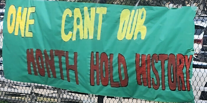 POST Glix Drap Glix Drap Community Member • points posts comments upvotes FollowUnfollow Premium Premium user. Get details. 5 days ago
 You're missing an apostrophe.
2 2points reply View more comments #57Hot Smoke Fish Chicken Pork Pull Chop Pork
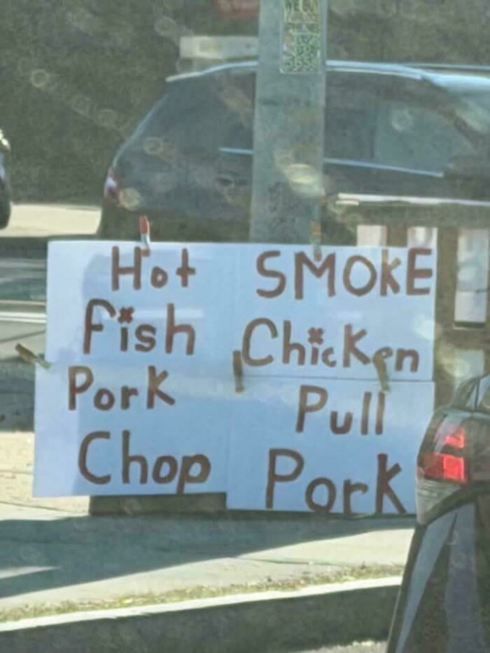 POST Meyrin Meyrin Community Member • points posts comments upvotes FollowUnfollow 4 days ago
 You must chop ze porko
1 1point reply #58Take David It Grutman Personal
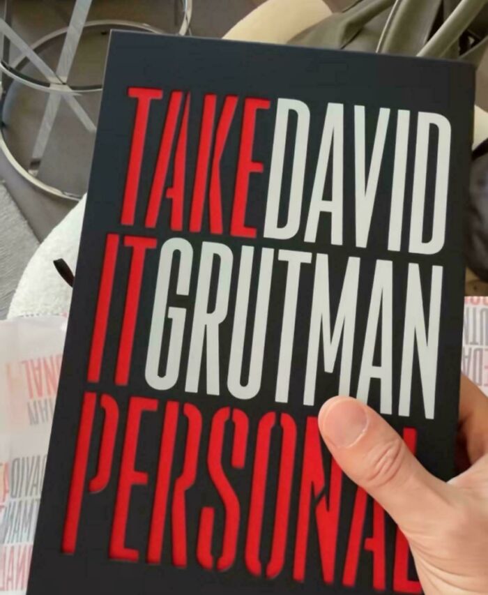 POST Glix Drap Glix Drap Community Member • points posts comments upvotes FollowUnfollow Premium Premium user. Get details. 5 days ago
 Nope, got too many Davids already.
1 1point reply #59You Don't Get To My Judge Pain
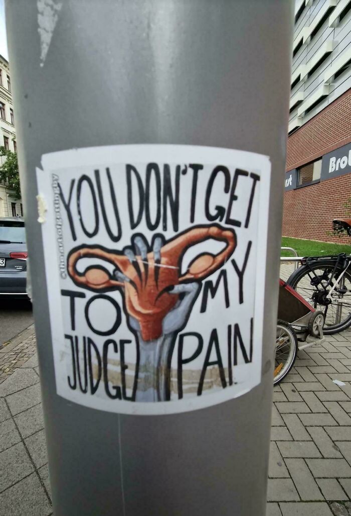 POST JF JF Community Member • points posts comments upvotes FollowUnfollow 1 hour ago
 Perhaps you'd have less pain if you took your nails out of your uterus?
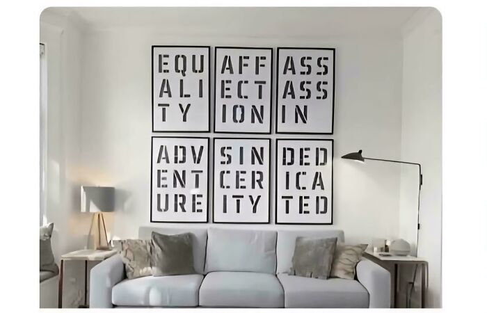
0 0points reply #60Equaffass Aliectass Tyionin Advsinded Entcerica Ureityted
 POST
POST  OmioneKanomi OmioneKanomi Community Member • points posts comments upvotes FollowUnfollow 5 days ago
 one of these things is not like the other...
11 11points reply View more comments #61Popo Pepe Yes Yes
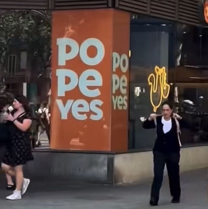 POST Glix Drap Glix Drap Community Member • points posts comments upvotes FollowUnfollow Premium Premium user. Get details. 5 days ago
 Yes, I did do a number two and a number one.
3 3points reply View more comments #62Free Chinese Delivery Cuisine
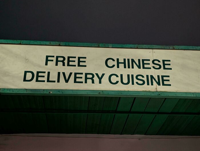 POST Roman Arendt Roman Arendt Community Member • points posts comments upvotes FollowUnfollow 5 days ago
 Does anyone know their number or other ways to order?
0 0points reply #63The A Novel Of The Titanic Girl On The Titanic
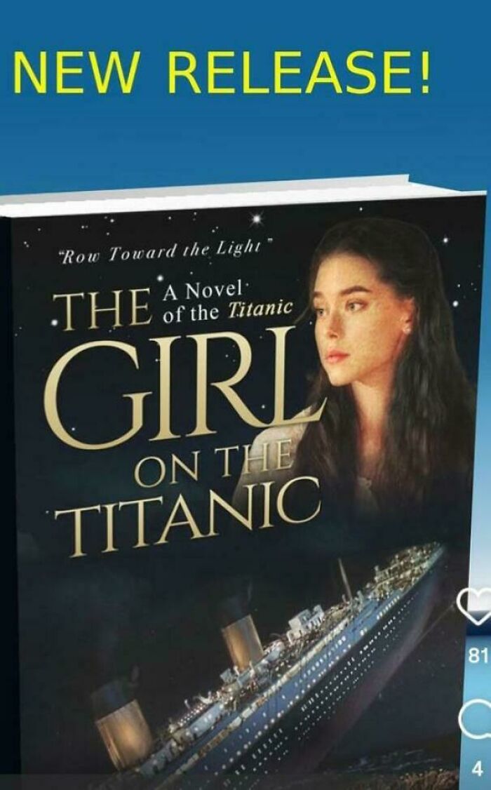 POST Glix Drap Glix Drap Community Member • points posts comments upvotes FollowUnfollow Premium Premium user. Get details. 5 days ago
 I have this sinking feeling this might be a bad novel.
7 7points reply View more comments #64I’m Your Ooo Arirang 20.03.2026 You’re My Hope
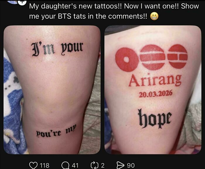 POST #65
 They Prove Wrong Can't Him Rip Charlie
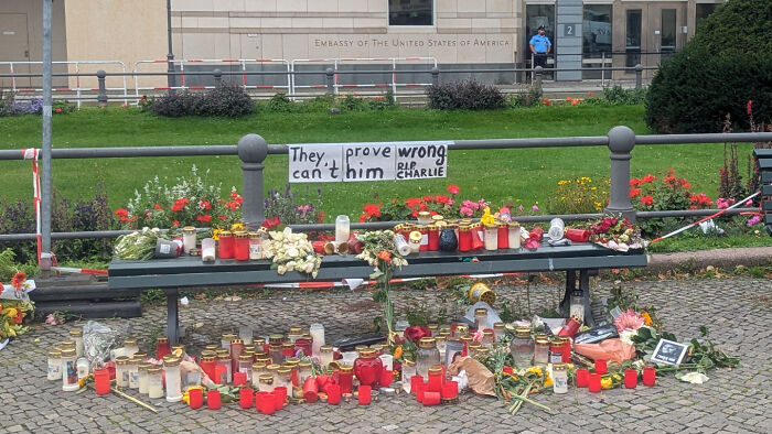 POST
POST  Greenkitty Greenkitty Community Member • points posts comments upvotes FollowUnfollow 5 days ago
 He was wrong and an a*s too.
8 8points reply View more comments #66God U Rip
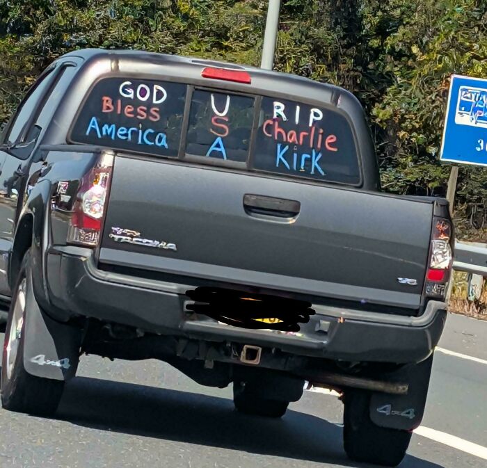 POST Glix Drap Glix Drap Community Member • points posts comments upvotes FollowUnfollow Premium Premium user. Get details. 5 days ago
 This comment has been deleted.
1 1point reply Newsletter Stay Tuned to Your Favorite Categories Weekly Highlights Daily Highlights Funny More categories Thank you! You've successfully subscribed to newsletters! Add New ImageAdd Your Photo To This List
Please use high-res photos without watermarks
Upload PhotoOoops! Your image is too large, maximum file size is 8 MB.
Not your original work? Add source
PublishOoops! Your image is too large, maximum file size is 8 MB.
UploadError occurred when generating embed. Please check link and try again.
Twitter Render conversationUse html version
Generate not embedded version
Add watermark Instagram Show Image Only
Hide Caption
Crop
Add watermark Facebook Show Image Only Add watermark Change Source
Title Update Add Image What do you think ?
POST  Elladine DesIsles Elladine DesIsles Community Member • points posts comments upvotes FollowUnfollow 5 days ago
 This theme has become ridiculous. The vast majority of these are perfectly clear to anyone not fiercely devoted to reading only left-right and up-down. They are just columns. Loose ones sometimes, sure, but still readable. Why do so many people seem to have a problem with columns?
1 1point reply 43Duckies 43Duckies Community Member • points posts comments upvotes FollowUnfollow 4 days ago You are really commited to defending bad design, aren't you? It's not that it's impossible to puzzle out the meaning; it's that if the sign takes even a *moment's* hesitation to read properly, it is failing in its job as a sign. (Now, art is a different story. But if you want to create ambiguous images that people can interpret in different ways, graphic design is a bad field to get into.)
May you like
POST Elladine DesIsles Elladine DesIsles Community Member • points posts comments upvotes FollowUnfollow 5 days ago This theme has become ridiculous. The vast majority of these are perfectly clear to anyone not fiercely devoted to reading only left-right and up-down. They are just columns. Loose ones sometimes, sure, but still readable. Why do so many people seem to have a problem with columns?
1 1point reply 43Duckies 43Duckies Community Member • points posts comments upvotes FollowUnfollow 4 days ago You are really commited to defending bad design, aren't you? It's not that it's impossible to puzzle out the meaning; it's that if the sign takes even a *moment's* hesitation to read properly, it is failing in its job as a sign. (Now, art is a different story. But if you want to create ambiguous images that people can interpret in different ways, graphic design is a bad field to get into.)
2 2points reply Load More Replies... Back to Homepage
  More about Funny Homepage
  Trending Funny Homepage Next in Funny Related on Bored Panda